Getting Started with Graphic Design: Exploring the Four Essential Principles
Holding a degree in graphic design isn’t a prerequisite for crafting stunning visuals. What’s essential is grasping the core principles of graphic design to ensure a cohesive user experience and effectively conveying messages through visual elements or text.
The cornerstone of graphic design encompasses four primary principles:
This article will delve into each of these principles, offering insights that deepen your understanding of graphic design and its application in marketing endeavors.
1. Color Theory
Color plays a pivotal role in design, serving not just to catch the eye but also to convey emotions and aesthetics. Often, we make quick judgments about something based on its color without even realizing it. The use of color to create contrast is vital. Contrast helps in distinguishing how prominently one color stands against another, facilitating text or elements to pop out against a background.
For instance, complementary colors like blue and orange or red and green offer stark contrast. An illustrative example is the Dunkin Donuts menu which skillfully incorporates their distinct orange and pink branding colors.
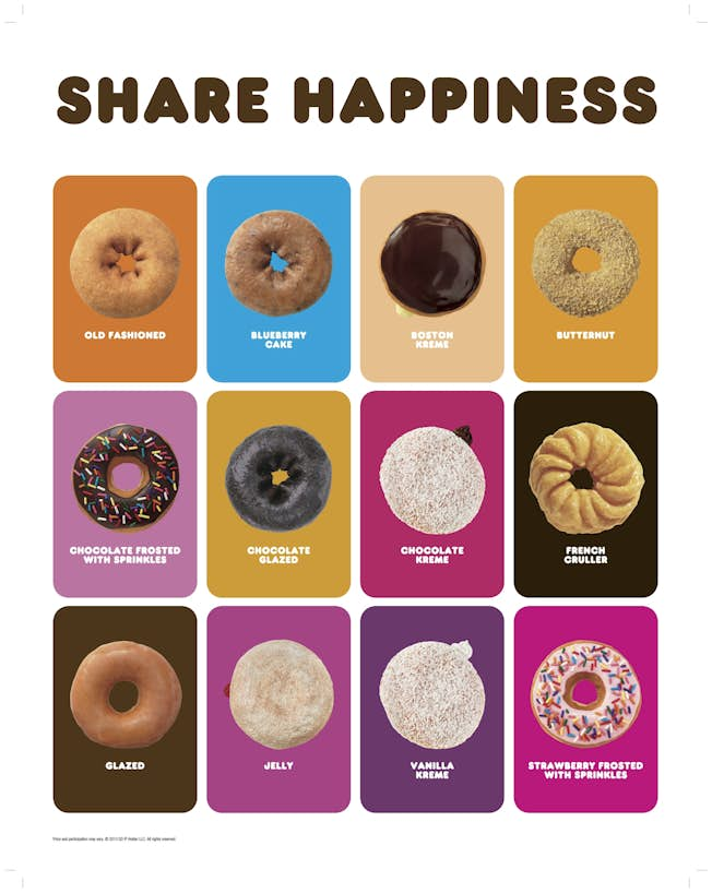
Contrast not only draws attention but can also drive user action, such as enhancing ‘click-through’ rates by distinguishing call-to-action buttons from the background. A color wheel can be a useful tool in visualizing how different colors interact, including their contrast and complementary nature.
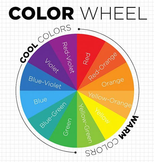
Colors are also imbued with meanings and can suggest actions; green often indicates a positive action, like ‘proceed’ or ‘yes’, while red might signal ‘stop’ or ‘cancel’, leading to potential user confusion if used contrary to common interpretations.
Implication of Colors in Branding
Colors evoke emotions and can significantly impact brand perception. Here’s a brief exploration of common brand colors and their associated emotions:
- Red evokes urgency and appetite, making it a popular choice in both the retail and fast-food industries.
- Orange conveys a sense of fun and vibrancy, suitable for brands with a more casual or approachable identity.
- Green represents health and growth, commonly used by wellness and financial sectors.
- Blue suggests calmness, trust, and reliability, often chosen by corporate and tech companies for its soothing effect.
- Pink is versatile, associated with femininity but also used to express playfulness and warmth in modern branding.
- Black denotes sophistication and luxury, ideal for high-end products and services.
- White and silver reflect cleanliness and modernity, frequently employed to create a sleek, minimalist aesthetic.
2. The Role of Imagery
High-quality images that resonate with viewers can significantly enhance digital content. People are naturally drawn to images featuring human faces as they establish an emotional bond and reflect the target audience.

Furthermore, the clarity of images is crucial. In e-commerce, for example, the ability to examine product details closely can make or break a sale. Effective design incorporates high-definition images that are well-suited to the device on which they’ll be viewed, avoiding any degradation in quality across different screen sizes.
Given the prevalence of mobile web browsing, testing graphics on mobile devices to ensure their integrity is paramount. Adapting images to fit various screen resolutions can prevent them from appearing distorted or pixelated on handheld devices.
A guideline to optimal image sizes for varying display formats includes:
- Comprehensive Banner: 2000px by 800px
- Slider Carousel: 1920px by 890px
- Interactive Icons: 300px by 300px
- Social Media Post: 425px by 220px
- Portfolio Showcase: 1920px by 768px
3. Typography Insights
Selecting the right typeface is fundamental to effective visual communication. Sticking to familiar and easy-to-read fonts like Arial or Helvetica ensures content accessibility and readability. Using a limited palette of font families maintains consistency and clarity across your designs.
Complementary font pairings can achieve a balanced and aesthetically pleasing look. For example, pairing an assertive display font with a more understated, traditional typeface can create an engaging visual harmony.

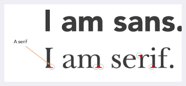
Understanding the distinction between Serif and Sans-serif fonts, and applying them appropriately, further refines the typography of your digital content. Serifs are often used in print to enhance readability, while Sans-serif varieties offer a cleaner look for digital displays.
Moreover, it’s advisable to collaborate with web development teams to overlay responsive text over images, ensuring legibility across devices. This approach sidesteps issues arising from embedded text in images, which can impair readability on mobile screens and hinder translation efforts.
Should text overlay be necessary, color contrast is crucial for legibility. Experimenting with background variations can unveil optimal combinations for readability and visual appeal. A simple tweak such as darkening the borders can significantly enhance contrast, as demonstrated below.
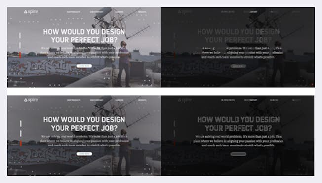
“Keep in mind, the synergy between imagery, textual content, and typography is pivotal in defining the success or failure of your design in captivating your intended audience.”
Addressing digital accessibility encompasses several considerations, including image alt text, link descriptions, and color contrast, all of which are vital in optimizing the user experience across various touchpoints.
4. Mastering Composition
With the elements of color, imagery, and typography chosen, the next step involves their strategic arrangement—or composition. The objective should be to achieve design simplicity and elegance, minimizing clutter to enhance focus on the primary message or action desired.
Effective composition entails the logical and clear organization of content elements, ensuring each serves a singular, defined purpose within the design. When crafting a design, clearly defining its goal—whether to inform, engage, or prompt action—is crucial in guiding successful composition strategies.
Embracing Simplicity in Design
The essence of minimalism in design is not merely the removal of elements but the careful selection of what to include to tell your narrative effectively. Leveraging whitespace and eliminating non-essential components are foundational to maintaining focus and user engagement.
Whitespace, when used effectively, directs the viewer’s attention precisely where desired, without overwhelming them. Each element within the design must justify its presence by contributing purposefully to the narrative or function.
Medium is a prime example of this principle in action, creating an uncluttered reading environment that centers on content, enhancing user engagement.
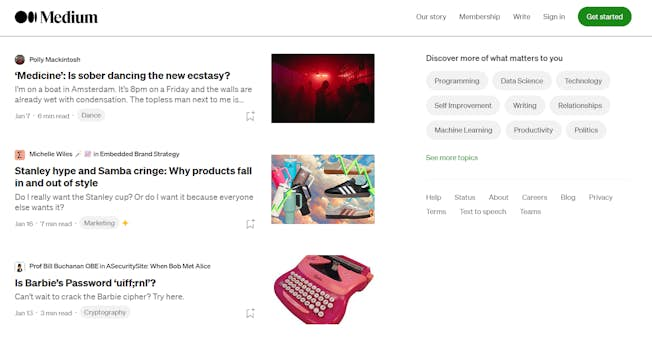
Remember, effective design does not forsake functionality for aesthetic, as evidenced by platforms like Reddit, which, despite its simplistic design, commands a loyal user base due to its high functionality.

A focal point should dominate simple design principles, exemplified by TikTok, which emphasizes content viewing by minimizing distractions.
Concluding Thoughts on Graphic Design Principles
By focusing your efforts on mastering the essential elements of graphic design—color, imagery, typography, and composition—you can ensure your designs resonate deeply with your target audience.
Elevate Your Design Aptitude
Enhance your understanding of graphic design fundamentals with HubSpot Academy and Digital Marketing Institute’s Graphic Design course. Delve into crucial concepts like color theory and discover how imagery, typography, and composition can embody your brand’s vision. Embark on this journey today and transform your design capabilities!
Related
OptiPrime – Global leading total performance marketing “mate” to drive businesses growth effectively. Elevate your business with our tailored digital marketing services. We blend innovative strategies and cutting-edge technology to target your audience effectively and drive impactful results. Our data-driven approach optimizes campaigns for maximum ROI.
Spanning across continents, OptiPrime’s footprint extends from the historic streets of Quebec, Canada to the dynamic heartbeat of Melbourne, Australia; from the innovative spirit of Aarhus, Denmark to the pulsating energy of Ho Chi Minh City, Vietnam. Whether boosting brand awareness or increasing sales, we’re here to guide your digital success. Begin your journey to new heights with us!

